I began this project a while ago in hopes that it would be a quick, fun data investigation. Of course life got in the way, and now I’m finally pulling it out from the back burner and putting the finishing touches on it. It is by no means as polished or thorough as I would like it to be, but sometimes done is better than perfect. I’ve learned a lot about processing and analalyzing data in R since I began, so my code is an odd mix of current and not-so-current techniques. Hopefully there is a very small group of people that finds this interesting - on to more investigating!
Questions
For this project, I had three main questions I was interested in answering.
- Has the mean date of breaking leaf buds changed over the course of 10 years in Colorado?
- What effect, if any, does elevation have on date of first bud break? Has the date at certain elevations become later?
- What is the most prominent factor in determining bud break date?
Data was acquired from the USA National Phenology Network.
Follow my process below as I tidy data, explore through visualizations, and use linear regression to determine which factors have the largest effect on bud break date.
Begin by loading data and inspecting, followed by loading the packages I needed to use.
urlfile <- 'https://raw.githubusercontent.com/alicekeller/Phen_data/main/site_phenometrics_data.csv'
phen <- read.csv(urlfile)
head(phen)
library(tidyverse)
library(ggcorrplot)
library(lubridate)
library(grid)
library(gtable)
library(gridExtra)
library(ggridges)
After inspecting, I (painstakingly - there has to be a better way!) removed columns with information that wasn’t relevant to my questions and would just make analysis more clunky. After doing this, I changed the structure of some of the columns that weren’t in the correct format for analysis.
phen2 <- select(phen, -c(1, 3, 4, 5, 7, 11, 12, 14, 15, 16, 18, 20, 23, 24, 25, 26, 27, 28, 29, 30,
                         31, 32, 33, 34, 35, 36, 37, 38, 39, 40, 41, 42, 43, 44, 45,
                         46, 47, 48, 49, 50, 51, 65, 67))

phen2$Phenophase_ID <- as.factor(phen2$Phenophase_ID)
phen2$Site_ID <- as.factor(phen2$Site_ID)
phen2$Species_ID <- as.factor(phen2$Species_ID)
phen2$Species <- as.character(phen2$Species)
phen2$Genus <- as.character(phen2$Genus)
phen2$Phenophase_Description <- as.character(phen2$Phenophase_Description)
phen2$Species_Functional_Type <- as.character(phen2$Species_Functional_Type)
phen2$Site_ID <- as.factor(phen2$Site_ID)
phen2$Species_ID <- as.factor(phen2$Species_ID)
phen2$Mean_First_Yes_Year <- as.factor(phen2$Mean_First_Yes_Year)
str(phen2)
Now that things are in their correct formats, I did some manipulation. For instance, the data include minimum and maximum temperatures for each season - a more informative metric for me would be mean temperature for each season. I mutated the data to find the mean for each.
phen2 <- phen2 %>%
  mutate(Tavg_Winter = rowMeans(cbind(Tmax_Winter, Tmin_Winter)),
         Tavg_Spring = rowMeans(cbind(Tmax_Spring, Tmin_Spring)),
         Tavg_Summer = rowMeans(cbind(Tmax_Summer, Tmin_Summer)),
         Tavg_Fall = rowMeans(cbind(Tmax_Fall, Tmin_Fall))
         )
Another column to create comes from changing Mean_Daylength, which is in seconds, to daylength_sec, and then dividing by 60 to get our new column, daylength_min.
phen2 <- phen2 %>%
  rename(daylength_sec = Mean_Daylength) %>%
  mutate(daylength_min = daylength_sec/60)
Time to check for missing values, and in this case, remove them. Sometimes missing values are useful and the fact that a value is missing denotes something else about the data. In this case, a missing value could mean that there is an observation present in the row, but not about contained in the variables I’m working with. Thus, I removed the missing data. The values were reading as -9999 so to start I changed them to read as NA and then used the na.omit function.
phen2[phen2 < -1000] <- NA
colSums(is.na(phen2))

phen2 <- na.omit(phen2)
nrow(phen2)
summary(phen2)
Renaming a few columns to be less cumbersome.
phen2 <- phen2 %>%
  rename(Year = Mean_First_Yes_Year,
         DOY = Mean_First_Yes_DOY)
Initial Exploration
Plot a few initial visualizations to get an idea of spread of data.
my.theme <- theme(
  plot.title = element_text(color = "black", size = 22, face = "bold"),
  axis.title = element_text(color = "black", size = 18),
  axis.text = element_text(color = "black", size = 16),
  legend.text = element_text(color = "black", size = 12))

p1 <- ggplot(phen2, aes(DOY, daylength_min)) +
    geom_point(aes(color = Phenophase_ID), alpha = 0.5, size = 3) +
    labs(title = "Daylength per Day of Year",
         x = "DOY", y = "Daylength (minutes)", color = "Phenophase ID") +
  theme_classic() +
  my.theme +
  guides(color = guide_legend(ncol = 2))
p1
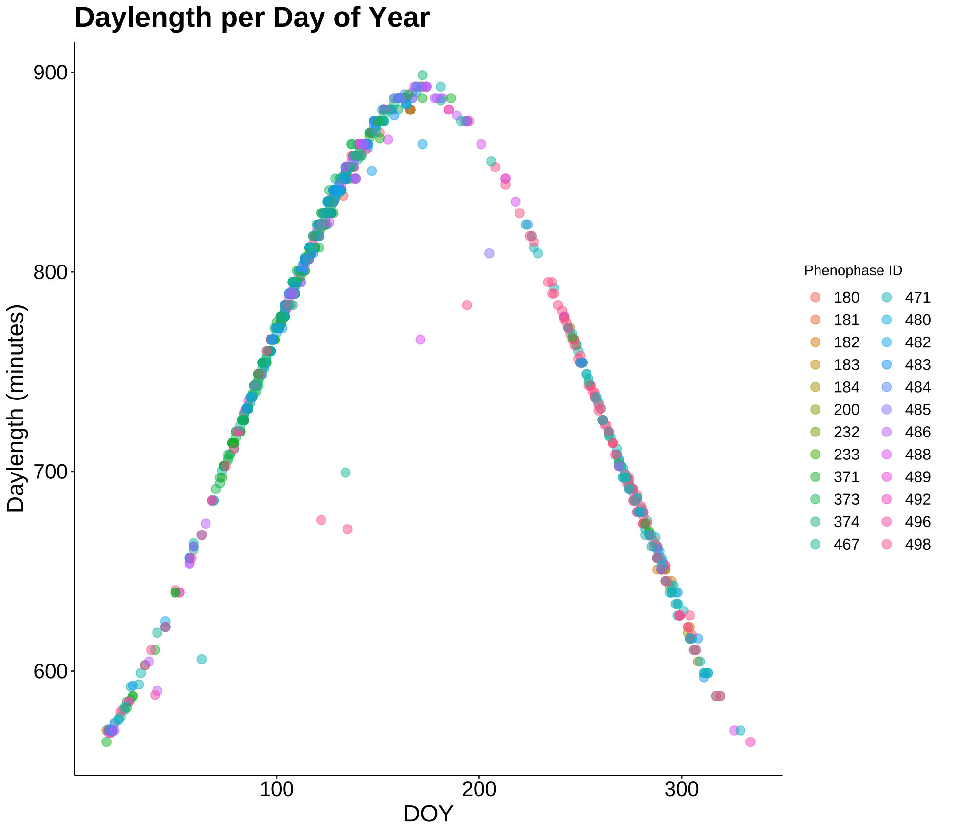
This plot shows the daylength for each day throughout the year where a phenologic event took place and was recorded. The data follows a normal distribution in this way. Mainly, this plot tells us that phenologic events (bud break date being one of them) are almost fully dependent upon daylength.
p2 <- ggplot(phen2, aes(Elevation_in_Meters, DOY)) +
    geom_jitter(aes(color = Phenophase_ID), alpha = 0.5) +
    labs(title = "Day of bud break by elevation", x = "Elevation (m)",
         y = "Day of bud break", color = "Phenophase ID") +
    theme_classic() +
  my.theme +
  guides(color = guide_legend(ncol = 2))
p2

p3 <- ggplot(phen2, aes(Year)) +
    geom_bar() +
    labs(title = "Phenologic event count by year") +
  theme_classic() +
  my.theme
p3
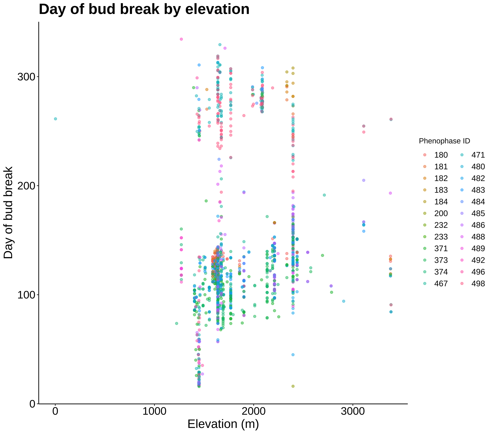
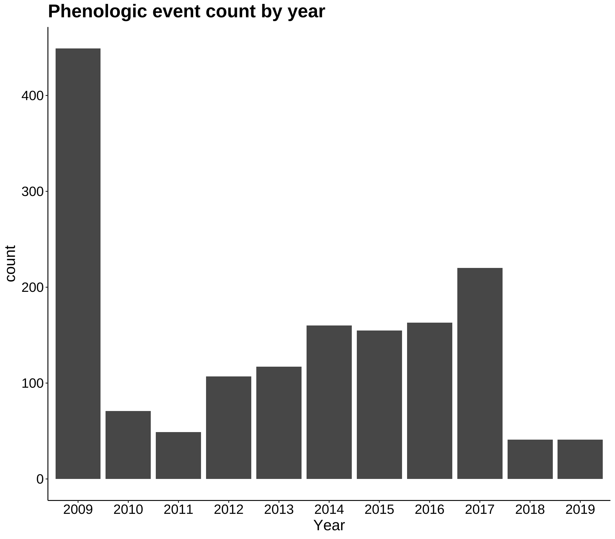
More exploration plots - dates of different phases over an elevation gradient and counts of specimens for each year.
Leaf bud Explorations
Next I created a subset with only the leaf bud data included - in the dataset, this is Phenophase_ID = 371 or 373.
leaf_bud <- subset(phen2, Phenophase_ID == 371 | Phenophase_ID == 373)

# omit points beyond day 213 - end of July. Plant leaves should have initial buds by this point.
leaf_bud <- subset(leaf_bud, DOY < 213)
p4 <- ggplot(leaf_bud, aes(Year, DOY)) +
    geom_jitter(alpha = 0.5) +
  labs(title = "Day of leaf bud break over time", y = "Day of year") +
  theme_classic() +
  my.theme
p4

p5 <- ggplot(leaf_bud, aes(DOY, Phenophase_ID)) +
  geom_jitter(aes(color = Year), alpha = 0.5) +
  labs(title = "Day of leaf bud break over time by year", x = "Day of year",
       y = "Phenophase ID") +
  theme_classic() +
  my.theme
p5

p6 <- ggplot(leaf_bud, aes(Elevation_in_Meters, DOY)) +
      geom_jitter(alpha = 0.5) +
      geom_smooth(method = lm) +
      labs(title = "Day of bud break by elevation", x = "Elevation (m)",
           y = "Day of year") +
  theme_classic() +
  my.theme
p6
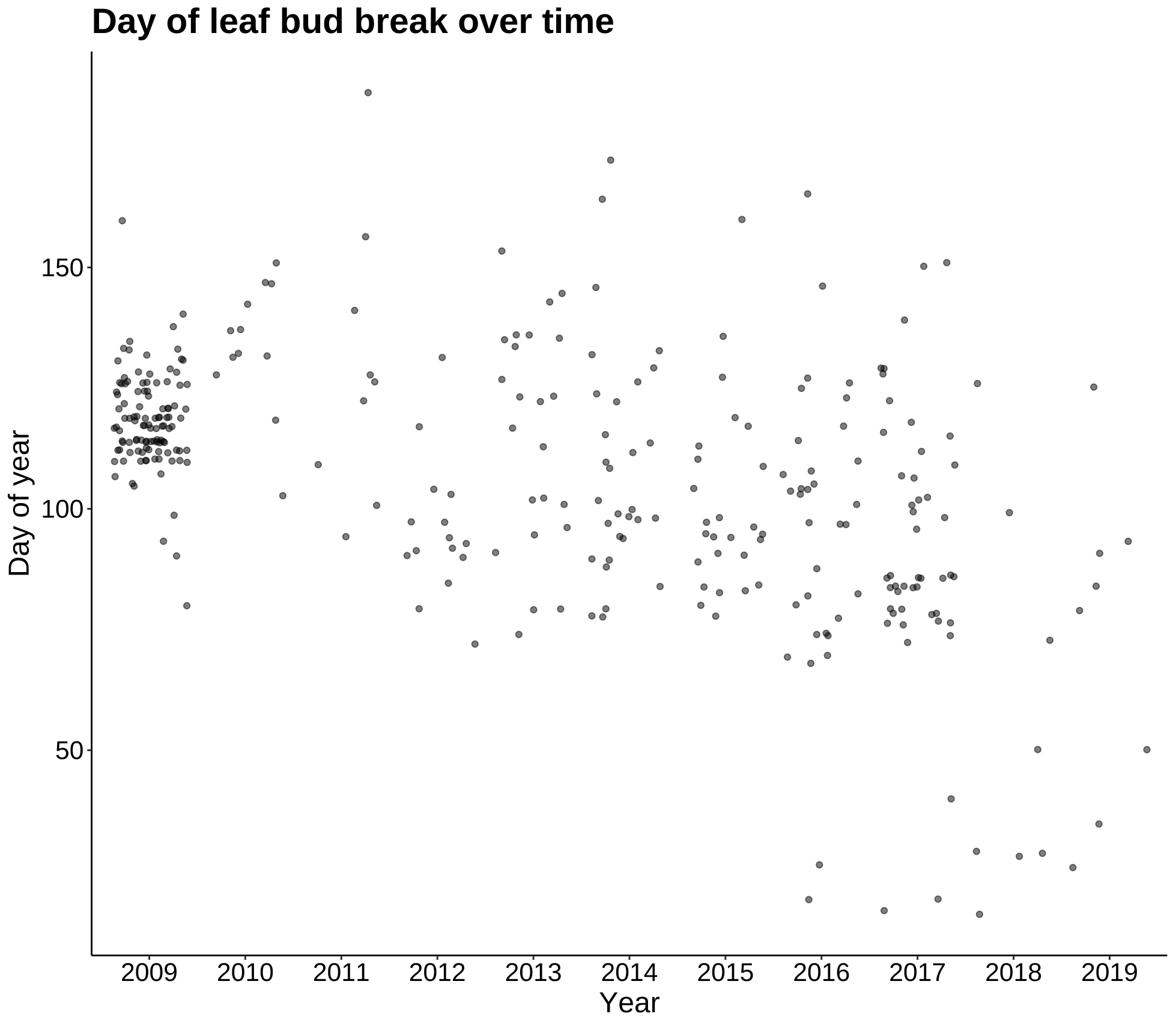
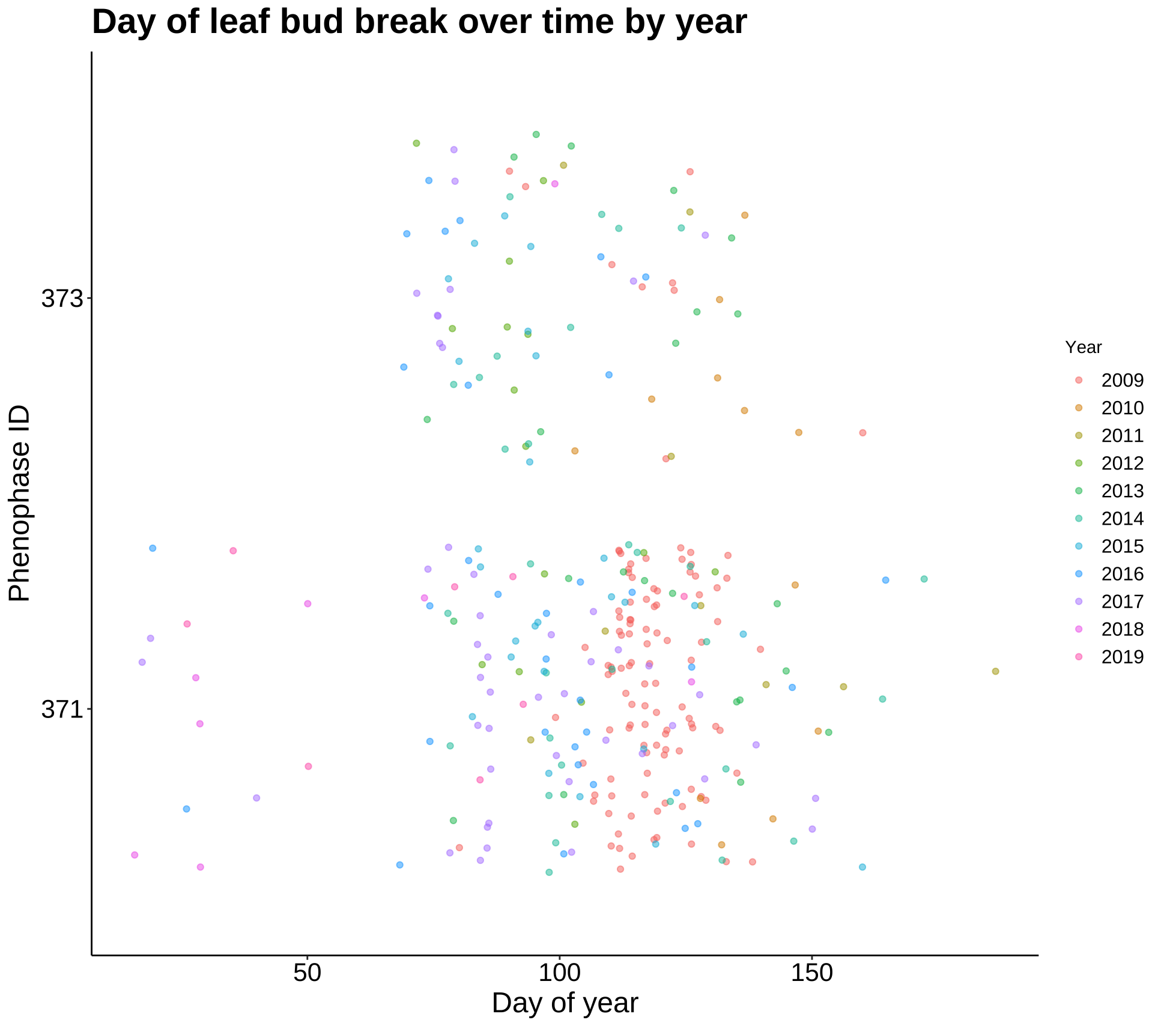
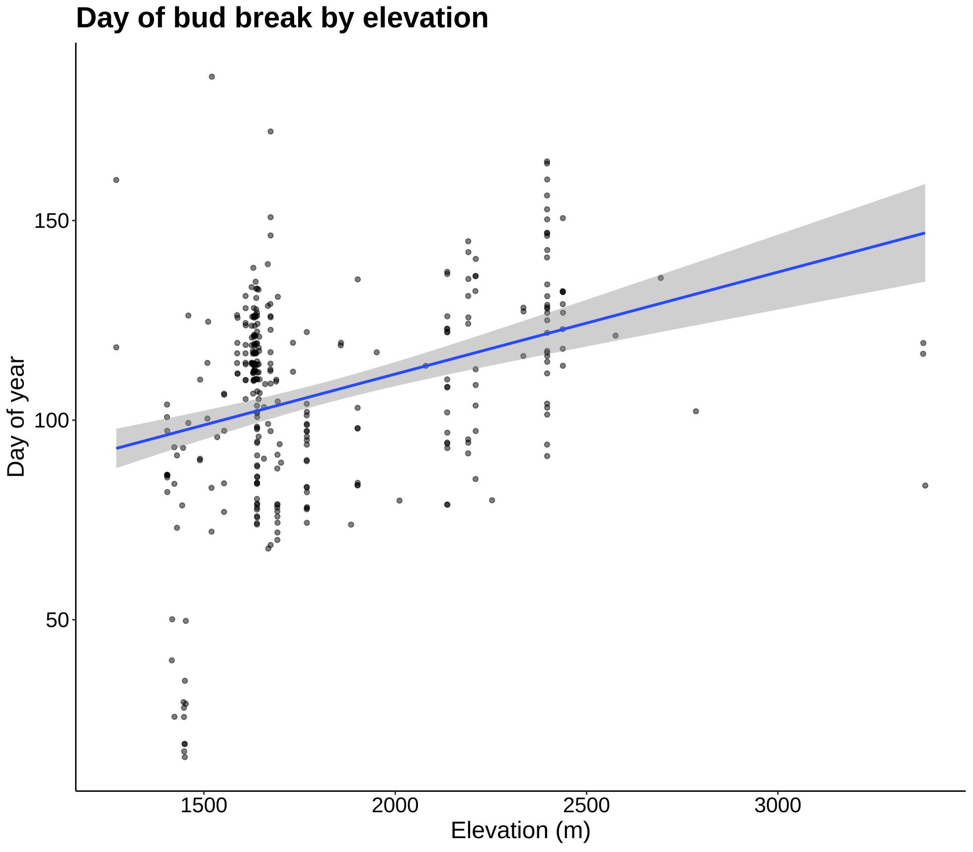
These plots are most summaries and visualizations of our leaf bud data. The first two show date of initial bud over 10 years. This date appears to be getting later as time goes on, but the next plot will quantify this. The last plot shows date of first leaf bud break as a function of elevation, and as the regression line shows, the date gets later as elevation increases.
p7 <- ggplot(leaf_bud, aes(Year, DOY)) +
  geom_jitter(color = "tan4", alpha = 0.7) +
  geom_boxplot(fill = "olivedrab2", color = "black", alpha = 0.3) +
  theme_classic() +
  xlab("Year") + ylab("Day of bud break") +
  ggtitle("Day of leaf bud break over 10 years in Colorado") +
  my.theme
p7
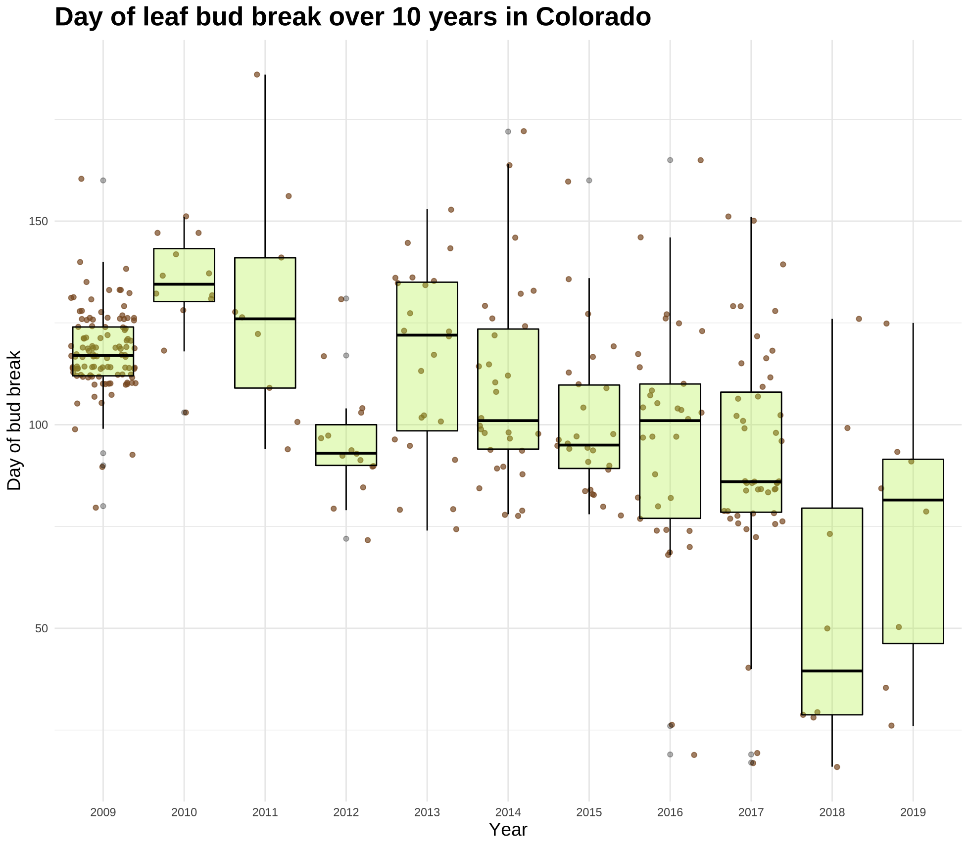
This plot conveys the sample size and mean bud break date, but it’s not overtly obvious to see the change over time at a glance. I decided to create another plot using the same data but using the ggridges package.
p7s <- leaf_bud %>%
  ggplot(aes(x= DOY, y = Year, group = Year)) +
  geom_vline(xintercept = 79, size = 1, color = "tan4") +
  geom_text(x = 35, y = 11.7, label="First day \nof Spring", color = "tan4", family = "permanent", size = 6) +
  geom_segment(aes(x = 52, y = 11.5, xend = 76, yend = 11.3),
               arrow = arrow(length = unit(0.4, "cm")),
               color = "tan4") +
  geom_density_ridges(scale = 1.5, alpha = 0.7, fill = "olivedrab3", color = "black") +
  scale_y_discrete(limits = rev(levels(leaf_bud$Year))) +
  xlab("Day of Year") +
  labs(title = "When do leaves appear?",
       subtitle = "Mean day of leaf bud break over 10 years in Colorado",
       caption = "Plot: @alicemkeller | Data: USA National Phenology Network") +
  theme(axis.line = element_blank(),
        panel.grid = element_blank(),
        panel.border = element_blank(),
        panel.background = element_rect(fill = "cornsilk"),
        plot.background = element_rect(fill = "cornsilk"),
        text = element_text(family = "mulish"),
        axis.title = element_text(color = "black", size = 28),
        axis.text = element_text(color = "black", size = 16),
        plot.title = element_text(hjust = 0.4, vjust = 1, size = 46, family = "noto", face = "bold", color = "black"),
        plot.subtitle = element_text(hjust = 0.4, vjust = 1.5, size = 24, family = "noto", color = "black"),
        plot.caption = element_text(size = 12),
        axis.ticks.y = element_blank())
p7s
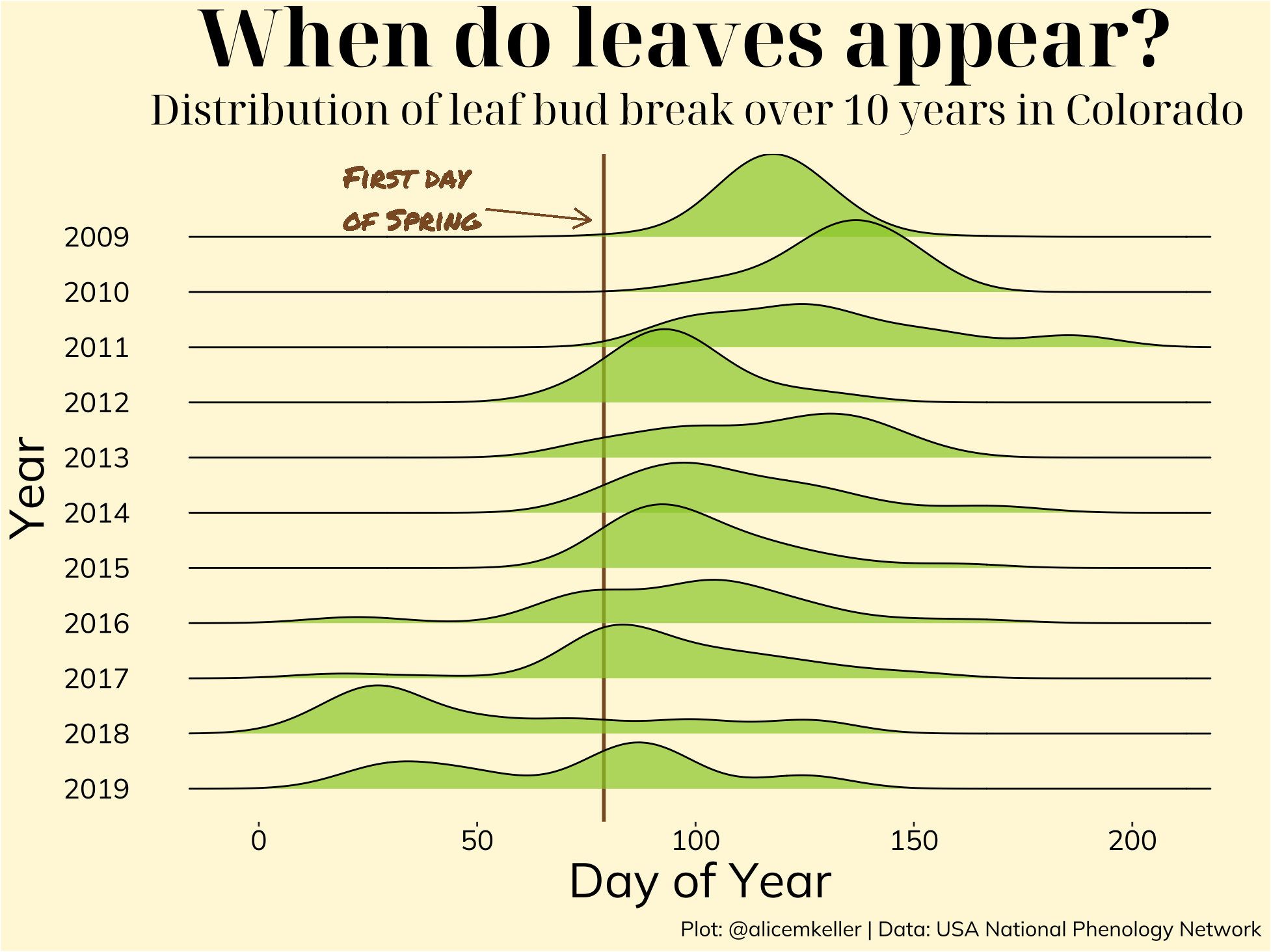
The two main takeaways that this plot communicates is the gradual decrease of mean bud break date (date getting earlier over time) and the emergence of a slight bi-modal distribution in some of the earlier years. Both of these are likely related to the temperature warming earlier in the year, leading the plant to believe spring is here when it may still be a month or two off.
While the distributions are shown visually in the plot above, I wanted to get one discrete mean bud break date for each year into a data frame for easier analysis.
mean_by_year <- aggregate(leaf_bud$DOY, list(leaf_bud$Year), mean)
names(mean_by_year) <- c("Year", "Mean_DOY")
mean_by_year
These means follow closely those in the plot above, but not completely.
Next I wanted to see the mean date of bud break, broken down by species. I ordered them by genus to see the differences in bud break dates of species from the same genus.
mean_by_species <- aggregate(leaf_bud$DOY, list(leaf_bud$Genus, leaf_bud$Species),
                             mean)
names(mean_by_species) <- c("Genus","Species", "Mean_DOY")
by_species <- mean_by_species[order(mean_by_species$Genus),]
head(by_species)
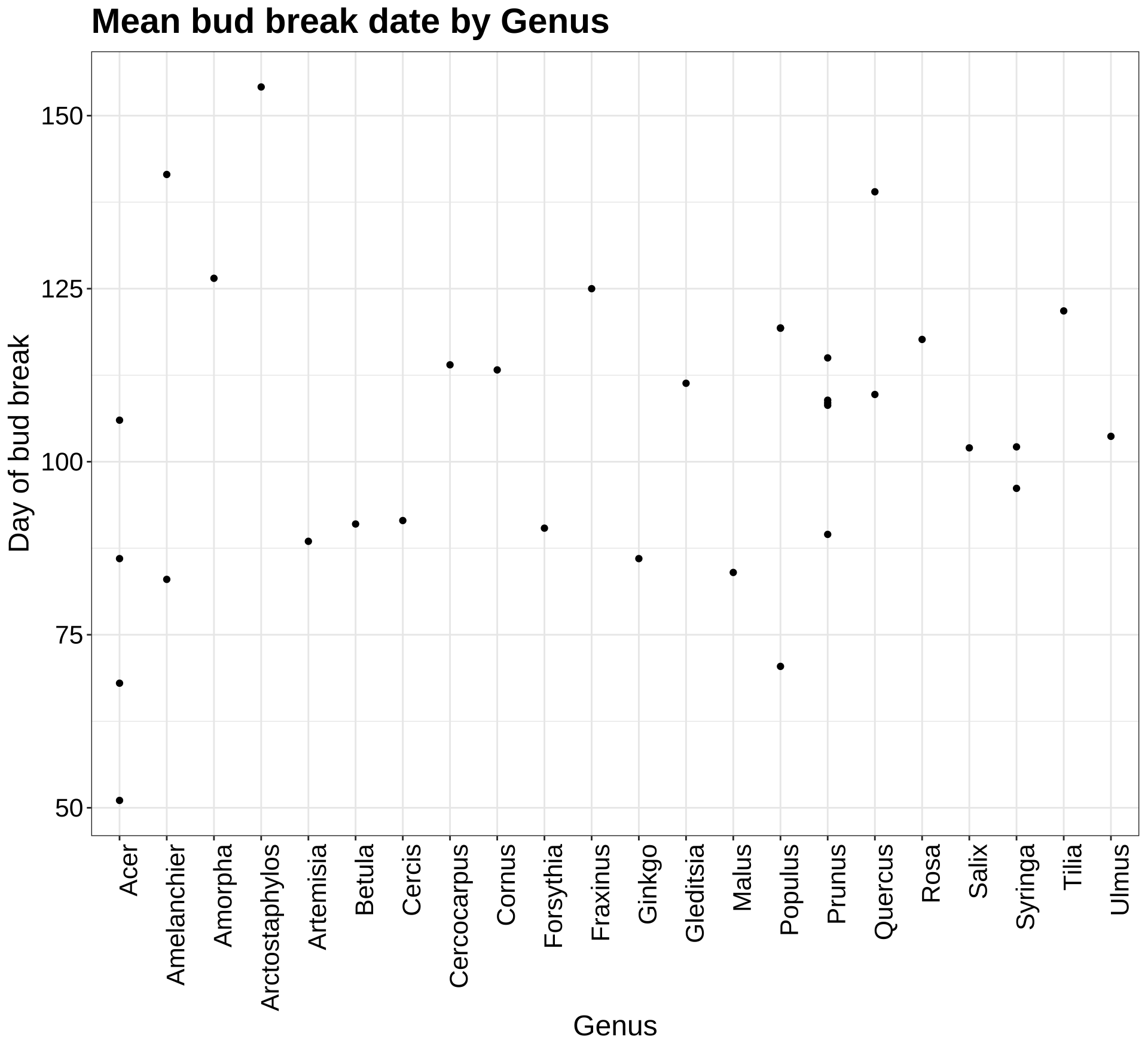
As we can see, even within the Acer genus, there is a lot of variation of mean date of bud break. This is depicted in the plot shown below, which visualizes the mean date of bud break for each genus.
p7a <- ggplot(by_species, aes(Genus, Mean_DOY)) +
  geom_point() +
  theme_bw() +
  theme(axis.text.x = element_text(angle=90, hjust=1)) +
  labs(title = "Mean bud break date by Genus", y = "Day of bud break") +
  my.theme
p7a
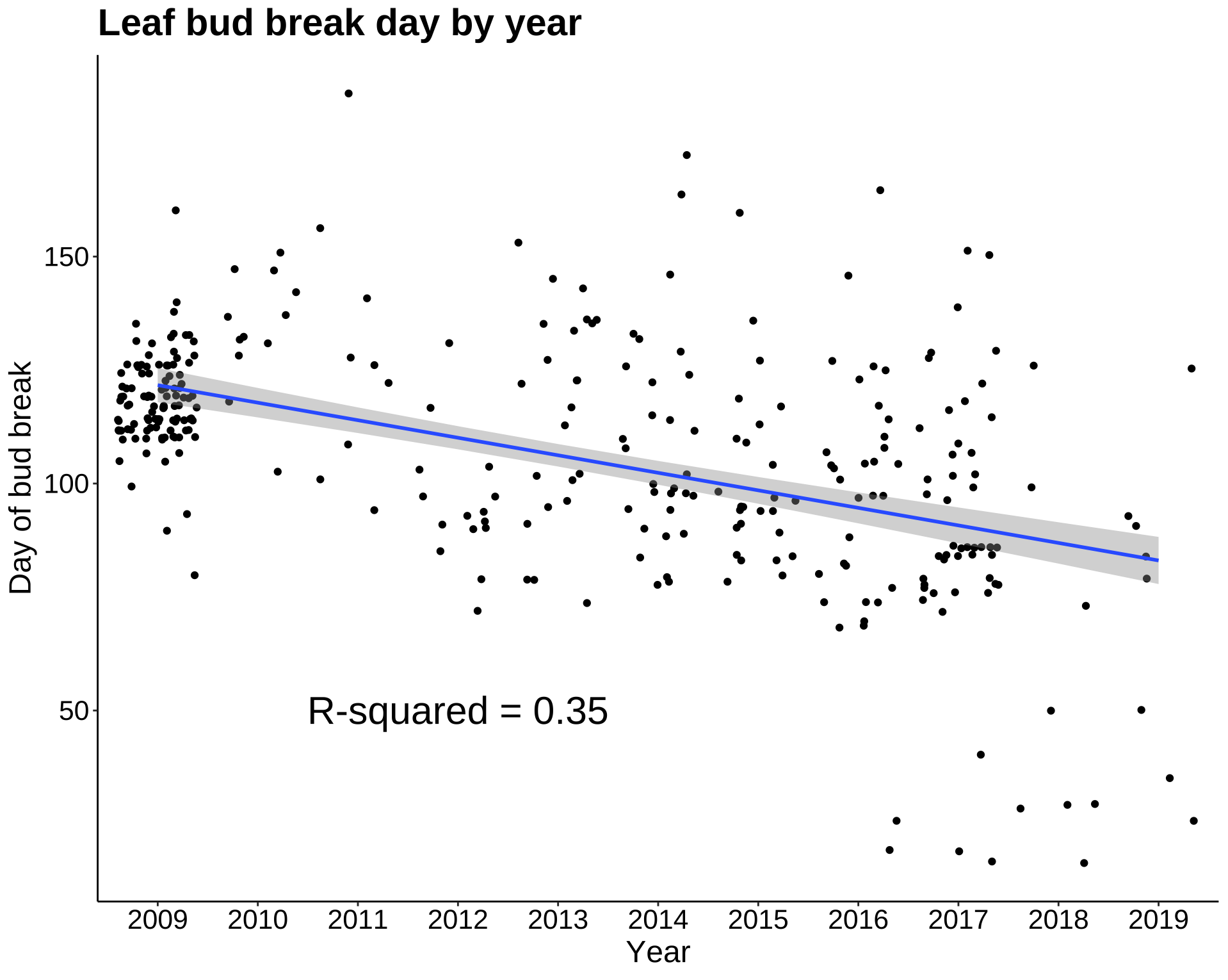
In the next plot, I added a regression line to the year/date of first bud break plot. While the mean first date of bud break appears to decrease year by year, the R-squared value is low. The linear model does not predict the date of first bud break with much accuracy. Let’s see what other abiotic factors may be highly correlated with date of first bud break.
p8b <- ggplot(leaf_bud, aes(Year, DOY)) +
  geom_jitter() +
  geom_smooth(method = lm, aes(group = 1)) +
  annotate("text", label = "R-squared = 0.35", x = 4, y = 50, size = 8, colour = "black") +
  labs(title = "Leaf bud break day by year", y = "Day of bud break") +
  theme_classic() +
  my.theme
p8b
Correlations and Predictions
p9 <- ggplot(leaf_bud, aes(daylength_min, DOY)) +
  geom_point() +
  labs(x = "Daylength (minutes)", y = "Day of bud break") +
  theme_classic() +
  my.theme
p9

p10 <- ggplot(leaf_bud, aes(Mean_Accum_Prcp, DOY)) +
  geom_point() +
  labs(x = "Accumulated precipitation (cm)") +
  theme_classic() +
  my.theme +
  theme(axis.title.y = element_blank())
p10

p11 <- ggplot(leaf_bud, aes(Prcp_Spring, DOY)) +
  geom_point() +
  labs(x = "Mean Spring Precipitation (cm)", y = "Day of bud break") +
  theme_classic() +
  my.theme
p11

p12 <- ggplot(leaf_bud, aes(Tavg_Spring, DOY)) +
  geom_point() +
  labs(x = "Mean Spring Temperature (C)") +
  theme_classic() +
  my.theme +
  theme(axis.title.y = element_blank())
p12

grid.arrange(p9, p10, p11, p12, nrow = 2)
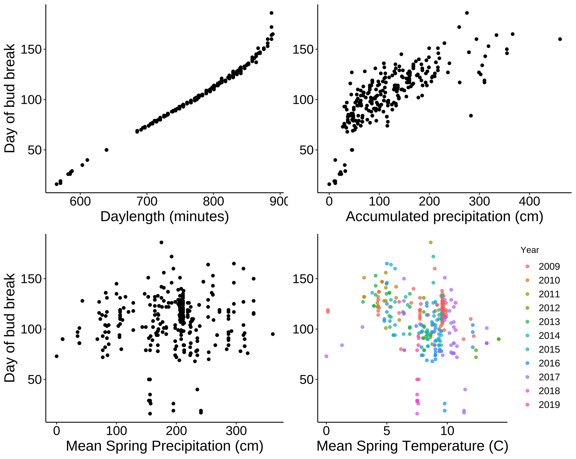
Mean accumulated precipitation and spring temperatures seems to have highest correlations. Here are values shown below.
a <- leaf_bud$daylength_min
b <- leaf_bud$DOY
c <- leaf_bud$Mean_Accum_Prcp
d <- leaf_bud$Prcp_Spring
e <- leaf_bud$Tavg_Spring

cor(c, b)
| Variable | Correlation with DOY |
|---|---|
| Daylength | 0.9913 |
| Accumulated Precip. | 0.7636 |
| Spring Precip. | 0.0914 |
| Avg. Spring Temp. | -0.2842 |
Daylength has the highest correlation, so as mentioned above, it is the best predictor of date of bud break. After that, mean accumulated (annual) precipitation seems to be the best predictor. Interestingly, the more precipitation that occurs, the later the date of first bud break. The next best predictor is average Spring temperature - as the temperature increases, date of first bud break gets earlier. Spring precipitation alone does not seem to be significantly correlated with date of first bud break.
Here I fit linear models to daylength, mean accumulated precipitation, and mean spring temperature to see how the data fit the model.
lm.doy.length <- lm(DOY ~ daylength_min, data = leaf_bud)
summary(lm.doy.length)

lm.doy.precip <- lm(DOY ~ Mean_Accum_Prcp, data = leaf_bud)
summary(lm.doy.precip)

lm.doy.temp <- lm(DOY ~ Tavg_Spring, data = leaf_bud)
summary(lm.doy.temp)
The model with the best fit is the one we could have guessed, daylength. This model gives an R-squared value of 0.9826. Obviously this factor has the most influence on when leaves break their buds. Beyond that, mean accumulated precipitation has the next largest influence (R-squared = 0.58). The factor with the next highest correlation, Tavg_Spring, did not have a good model fit (R-squared = 0.078) so does not seem to be a reliable predictor of date of first bud break in Colorado.
Takeaways
It seems that the spring bud break date for plants in Colorado is getting earlier over the course of the past 10 years. While this dataset is not very large, nor is the time frame very long, this is an intriguing speculation. Additionally, the largest predictor of when leaves break their buds is daylight length. This was proved multiple times by the data above. After that, we can look to mean annual accumulated precipiation as an indicator - counterintuitively, the more moisture plants get, the later they break their buds. This may be codependent on the lower temperatures that often accompany precipitation. These conclusions may not (and likely don’t) hold true in other parts of the country where plants are more dependent on temperature as the main signal to break their buds.
What will a gradual earlier bud break date mean for the birds, insects, and other animals that rely on these plants and the timing of their fruits and leaves? While I don’t know the answer now, this is a topic to keep a close eye on in the coming years! The science community may be able to anticipate these changes within ecosystems and start to prepare for them.
Full code for this project can be found on my Github.