This project stems from my love of running! While I’ve never done an ultramarathon, I’m fascinated with the reasons that would drive somebody to run that far (50+ miles).
I mainly wanted to investigate the relationship between age, gender, and speed with this project. The dataset is from an old Tidy Tuesday project that I thought looked interesting. It’s a large dataset with over 100,000 observations from many ultra races around the world. Some of the most popular and well-known are the UTMB, Western States, and the Leadville 100.
Follow along below as I explore the data and predict speed from various factors within the dataset! I’ve collapsed my code to make things more readable, but click the little black arrows on the left hand side to check it out.
Data Cleaning and Exploratory Data Analysis
Click for R code!
  library(tidyverse)
  library(tidytuesdayR)
  library(tidymodels)

  #load data
  tuesdata <- tidytuesdayR::tt_load(2021, week = 44)
  ultra_rankings <- tuesdata$ultra_rankings
  race <- tuesdata$race

  glimpse(ultra_rankings)
  glimpse(race)
Below is an initial plot of age and finishing time to get an idea of the shape of the data.
my.theme <- theme(
  plot.title = element_text(color = "black", size = 22, face = "bold"),
  axis.title = element_text(color = "black", size = 18),
  axis.text = element_text(color = "black", size = 16),
  legend.text = element_text(color = "black", size = 12))

p1 <- ultra_rankings %>%
  ggplot(aes(age, time_in_seconds)) +
  geom_jitter(aes(color = race_year_id), alpha = 0.7, show.legend = FALSE) +
  labs(title = "Ultramarathon finishing time by Age", x = "Age", y = "Time (seconds)") +
  theme_classic() +
  my.theme
p1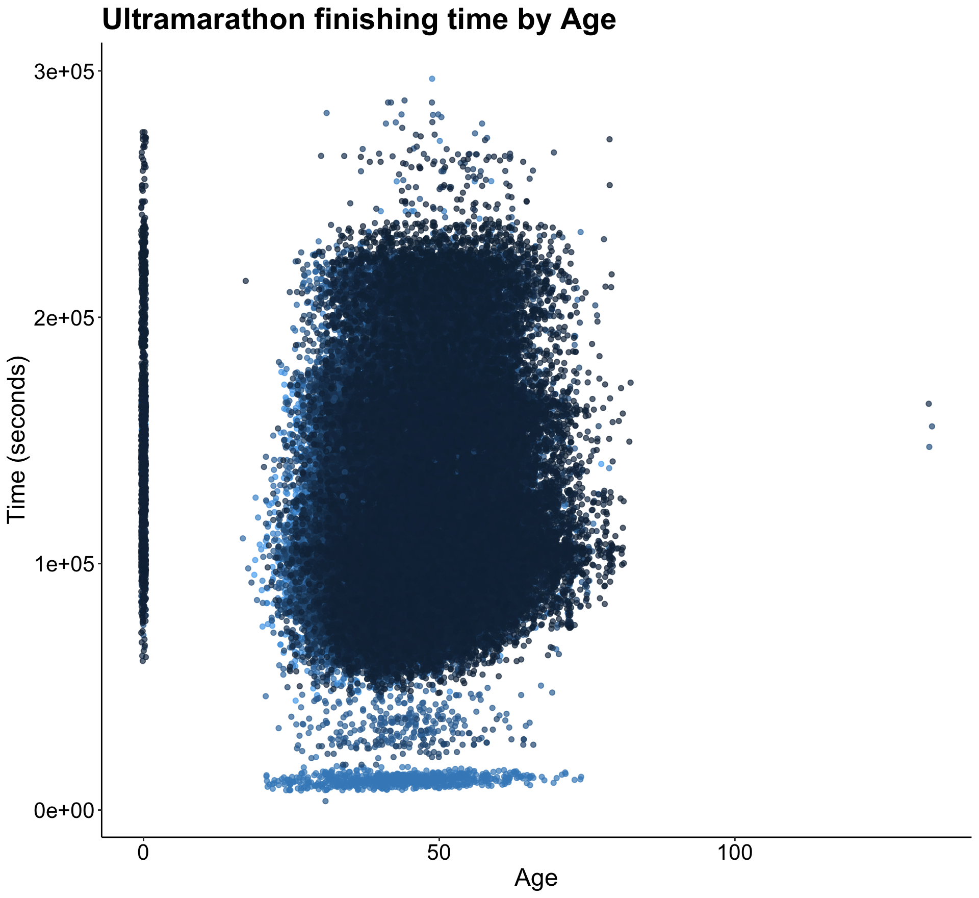
There seems to be many 0’s present in the data, which I eventually mutated to NA’s because there really isn’t any value in keeping them as zero.
I also wanted to join the two datasets with race info on the variable race_year_id, which is essentially a unique identifier for each race. You’ll see that I also changed a few of the variables to factors from numeric.
#inner join
joined <- ultra_rankings %>%
  inner_join(race, by = "race_year_id")

#changing race_year_id, rank, gender, nationality to factor
joined <- joined %>%
  mutate(race_year_id = as.factor(race_year_id),
         rank = as.factor(rank),
         gender = as.factor(gender),
         nationality = as.factor(nationality))
glimpse(joined)
After taking a look at the data a little more, I realized that one of my favorite races (the Leadville 100) didn’t have any distance data. I double checked the exact distance and added it in so the race could be a part of my analysis.
#leadville 100 distance is 0 - want it to be 100 mi
#first create new df with only leadville so can manipulate  those distances
leadville <- joined %>%
  filter(race_year_id == "25331")

#remove leadville stats with 0 distance from joined df
joined <- joined %>%
  filter(race_year_id != "25331")

#add in 100 mile distance in km to subsetted df
leadville$distance <-replace(leadville$distance, leadville$distance == 0, 160.9)

#row bind the two dataframes back together with updated leadville distance
joined <- joined %>%
  rbind(leadville)
Finally, I went back to my initial observation above and changed the zeros in the age and distance variables to have an NA value. This way I could simply omit NA’s and get rid of those values without sacrificing losing too much data (only omitting about 17,000 rows from 137,000).
After that, you’ll see me creating a new column called AgeAtRace, as the original dataset contained ages of participants now, not when they competed. Further explanation of this can be found in the original Github Repo for this project.
joined$age <- na_if(joined$age, 0)
joined$distance <- na_if(joined$distance, 0)
colSums(is.na(joined))


joined <- joined %>%
  drop_na()
colSums(is.na(joined))


joined <- joined %>%
  mutate(Year = lubridate::year(date)) %>%
  mutate(AgeAtRace = age - (2021 - Year))
Now that we have AgeAtRace, I wanted to take a look at the distribution of ages across all participants.
p2 <- joined %>%
  ggplot(aes(AgeAtRace)) +
  geom_histogram(aes(fill = gender)) +
  labs(title = "Frequency distribution of finisher ages", x = "Age",
       y = "Number of finishers") +
  theme_classic() +
  my.theme
p2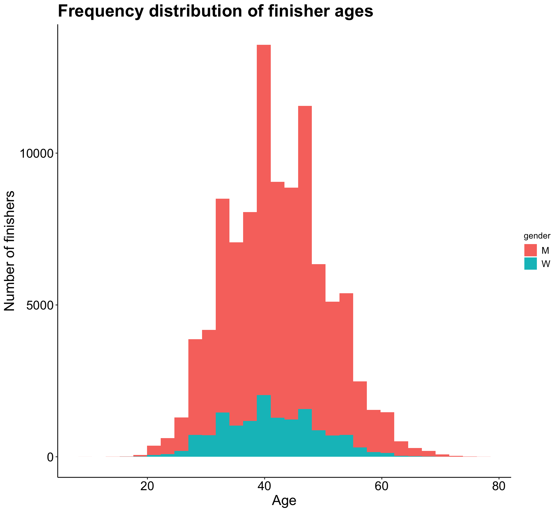
As we can see, a relatively normal age distribution for both men and women. It looks like I should filter the data to only include ages under 80, as there are a few points past that age that will skew future plots.
Let’s also take a look at how time to finish a race increases with age.
p3 <- joined %>%
  filter(AgeAtRace < 75) %>%
  ggplot(aes(AgeAtRace, time_in_seconds)) +
  geom_jitter(aes(alpha = 0.7), show.legend = FALSE) +
  labs(title = "Ultramarathon finishing time by age", x = "Age",
       y = "Time (seconds)") +
  theme_classic() +
  my.theme
p3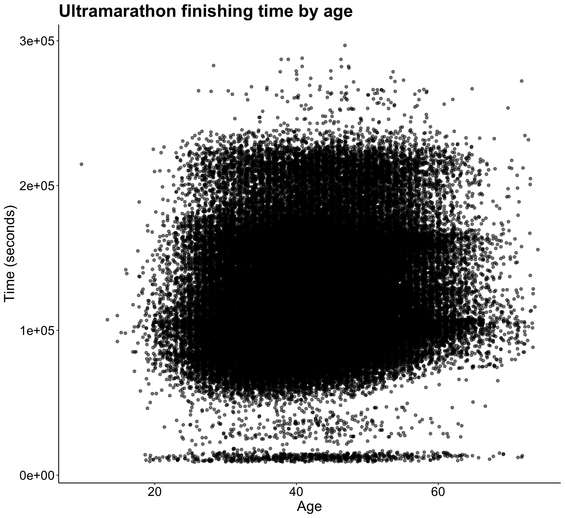
There’s not a clear pattern except for the presence of many almost-zeros in the time variable. I think I’ll need to address those to be able to get some more predictive results.
Before addressing the zeros, there is one last manipulation I wanted to make - creating a speed variable. It allows us to have a more standardized way of comparing finishers across all races, rather than using time alone. That wouldn’t be as useful since many of the races are different lengths and finish times would greatly vary across those lengths. You’ll see below I had to create a few other new variables before creating the mph (or speed) variable.
joined <- joined %>%
  rename(distance_km = distance) %>%
  mutate(time_in_min = time_in_seconds/60,
         distance_mi = distance_km/1.609) %>%
  mutate(time_in_hrs = time_in_min/60) %>%
  mutate(mph = distance_mi/time_in_hrs)
After some further investigating, I decided to omit all observations in the AgeAtRace column greater than 80 as there were a minimal amount of those to begin with. I also omitted finish times less than 150 minutes. I decided on this number because the shortest distance in this dataset is 20 miles, and running that in 150 would be a pace of 7.5 miles per hour. This is very fast! So it seemed like any time less than 150 minutes was likely error. Finally, along the same lines, I omitted speeds greater than 20 mph as it is impossible for a human to run that fast.
summary(joined)
joined <- joined %>%
  filter(AgeAtRace < 80,
         time_in_min > 150,
         mph < 20)
summary(joined)
Now let’s look at the distribution of speed across all races.
p4 <- joined %>%
  ggplot(aes(mph)) +
  geom_histogram(bins = 25) +
  labs(title = "Speed distribution of ultramarathon finishers", x = "Speed (mph)",
       y = "Number of finishers") +
  theme_classic() +
  my.theme
p4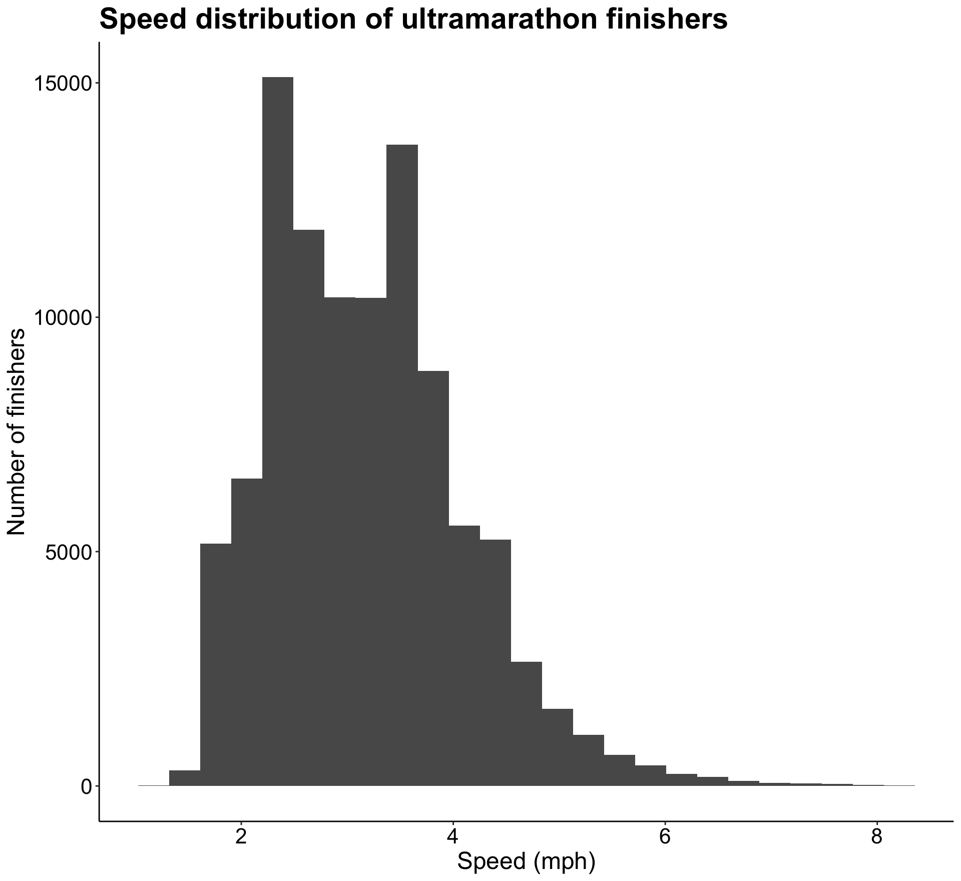
It seems like most speeds fall between 2 and 4 mph with a gradual right hand tail. Speed is the variable I’m hoping to be able to predict, but based on this lognormal distribution I think I’ll have to log transform the speed variable in order to create a reliable model with it.
Next I wanted to dig a little deeper into how speed varies by course. First I created a new data frame with average speed for each course, broken down by gender. I wanted to visualize this, so I changed the event variable into a factor.
event_avg <- joined %>%
  group_by(event) %>%
  summarise(course_speed = mean(mph)) %>%
  ungroup()

event_avg <- event_avg %>%
  mutate(event = as.factor(event))
glimpse(event_avg)
Below is the visualization of this data, although I did combine both gender’s averages into this plot.
p5 <- event_avg %>%
  top_n(20, course_speed) %>%
  ggplot(aes(fct_reorder(event, course_speed), course_speed)) +
  geom_col() +
  coord_flip() +
  labs(title = "Course speed of top 20 ultramarathon courses",
       y = "Course Speed",
       x = "Event name") +
  theme_classic() +
  my.theme
p5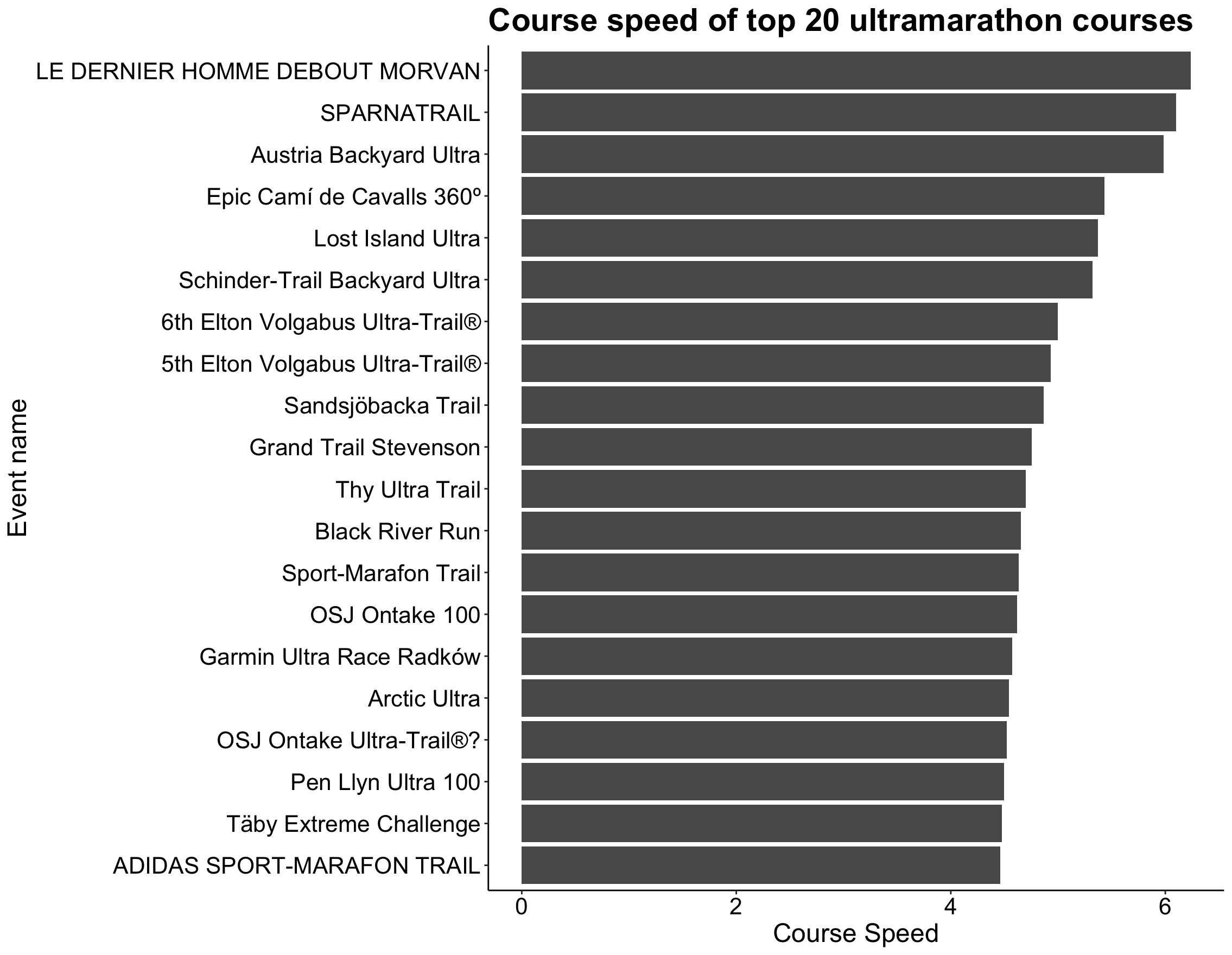
Although the names of the races probably don’t mean much to you (or even me!), it’s clear that some race courses have a significantly faster speed than other courses. This could depend on many factors, such as overall elevation gain, whether more men or women ran the race, and the mean age of participants.
Next I dove into individual runner speeds and if any runners have run more than one race. Many have run over 20 of the races included in this dataset! The fastest runners tend to have an average speed of greater than 8 mph, which is so fast to be running for a long distance.
joined %>%
  count(runner, sort = TRUE)
# A tibble: 58,402 × 2
runner n
<chr> <int>
1 FANCETT Kenneth 36
2 SMITH Mike 36
3 DONNELLY Susan 32
4 CATMUR Edward 28
5 THOMPSON David 26
6 JOHNSON Peter 25
7 NAKAMURA Sean 24
8 THOMPSON Mark 24
9 CARTER Williams 23
10 JONES Chris 23
# … with 58,392 more rows
#runner speed, arranged descending
joined %>%
  group_by(runner) %>%
  summarise(runner_speed = mean(mph)) %>%
  filter(runner_speed < 10) %>%
  arrange(desc(runner_speed))
# A tibble: 58,402 × 2
runner runner_speed
<chr> <dbl>
1 PICARD Romain 8.27
2 RAZET Vivien 8.25
3 BAHLA Sadek 8.24
4 PILLAT PIERRE ETIENNE 8.21
5 PEGEOT Pierre Alain 8.17
6 MATHIEU Damien 8.15
7 LACROIX Olivier 8.14
8 DOS SANTOS Matthieu 8.14
9 VANETTEN Taggart 8.13
10 GUILLOT Elise 8.11
# … with 58,392 more rows
#want to see runner speed per course
joined %>%
  group_by(event, runner) %>%
  summarise(runner_speed = mean(mph))
# A tibble: 86,216 × 3
# Groups: event [372]
event runner runner_speed
<chr> <chr> <dbl>
1 #Småland100 BELCASTRO Luigi 3.64
2 #Småland100 EKBLAD Jonathan 3.50
3 #Småland100 FERNEMAR Thomas 3.73
4 #Småland100 GUSTAVSSON Jimmy 3.64
5 #Småland100 Jonsson Daniel 3.73
6 #Småland100 STROEM Martin 4.43
7 #Småland100 WILSON Torbjorn 4.43
8 100 Mile Spa BREMMERS Paul 4.47
9 100 Mile Spa CHEVALIER Michael 4.03
10 100 Mile Spa DE CREMER Fabian 3.81
# … with 86,206 more rows
Visualized below is mean speed for men and women by age. It looks like the speed of men decreases with age faster and then spikes after 60, while women stay more consistent throughout their lives and actually outperform men from ages 25 - 65.
p6 <- joined %>%
  filter(mph < 10, AgeAtRace < 75) %>%
  ggplot(aes(AgeAtRace, mph)) +
  geom_smooth(aes(color = gender)) +
  labs(title = "Mean speed by age and gender",
       x = "Age (years)",
       y = "Speed (mph)") +
  theme_classic() +
  my.theme
p6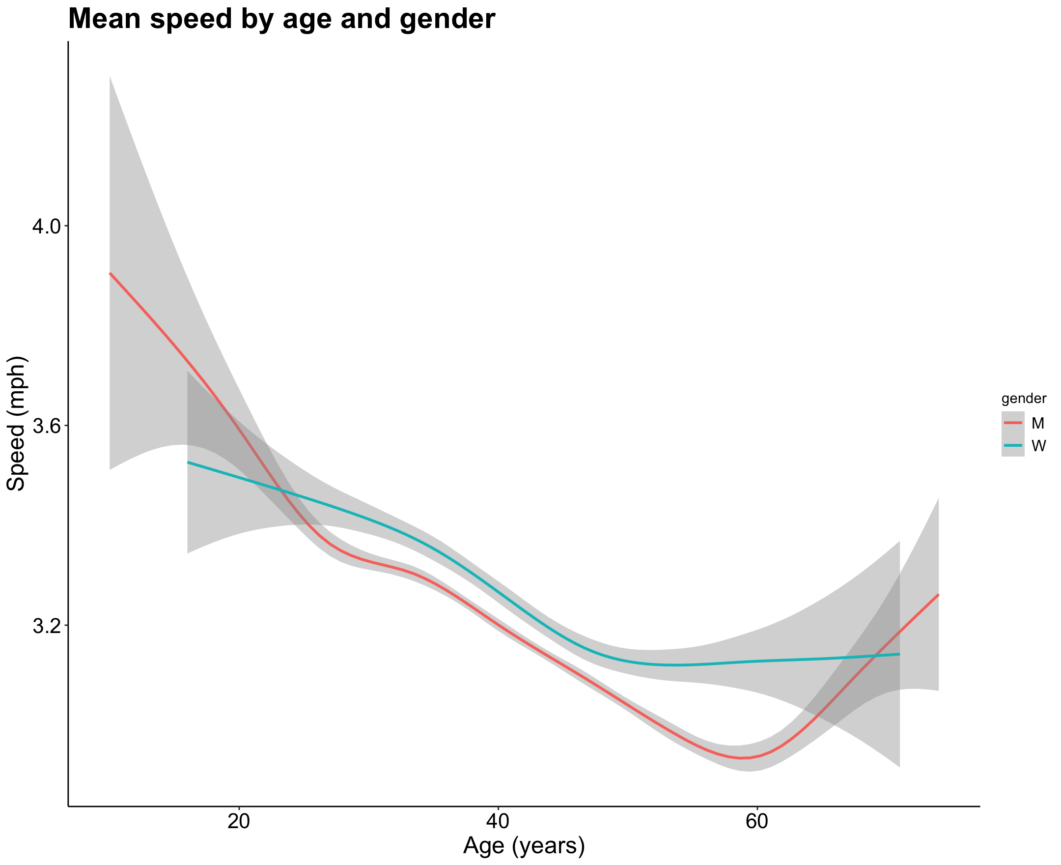
I was curious at the ratio of men vs. women within finishers. Had it changed over the 10 years that this dataset includes? Let’s take a look below and see.
First I created another new dataframe with the percentage of men and women finishers by year. I then visualized this to see if the percents have changed significantly over time.
gender_ratio <- joined %>%
  group_by(Year, gender) %>%
  summarise(count = n()) %>%
  mutate(per = count/sum(count) * 100) %>%
  mutate(per.round = round(per, 1)) %>%
  ungroup()
gender_ratio
# A tibble: 20 × 5
Year gender count per per.round
<dbl> <fct> <int> <dbl> <dbl>
1 2012 M 5037 85.9 85.9
2 2012 W 830 14.1 14.1
3 2013 M 7356 87.4 87.4
4 2013 W 1060 12.6 12.6
5 2014 M 8504 85.6 85.6
6 2014 W 1428 14.4 14.4
7 2015 M 8224 86.2 86.2
8 2015 W 1315 13.8 13.8
9 2016 M 8729 86.9 86.9
10 2016 W 1313 13.1 13.1
11 2017 M 10574 85.6 85.6
12 2017 W 1775 14.4 14.4
13 2018 M 13489 84.6 84.6
14 2018 W 2449 15.4 15.4
15 2019 M 14054 84.3 84.3
16 2019 W 2617 15.7 15.7
17 2020 M 4129 83.5 83.5
18 2020 W 816 16.5 16.5
19 2021 M 5859 86.4 86.4
20 2021 W 920 13.6 13.6
#convert year to factor for plot
gender_ratio <- gender_ratio %>%
  mutate(Year = as.factor(Year))
glimpse(gender_ratio)

p7 <- gender_ratio %>%
  ggplot(aes(Year, per, fill = gender, label = per.round)) +
  geom_col(aes(fill = gender)) +
  coord_flip() +
  geom_text(size = 3.5, position = position_stack(vjust = 0.3)) +
  labs(title = "Gender percentage of race finishers by year",
       y = "Percentage",
       x = "Year") +
  theme_classic() +
  my.theme
p7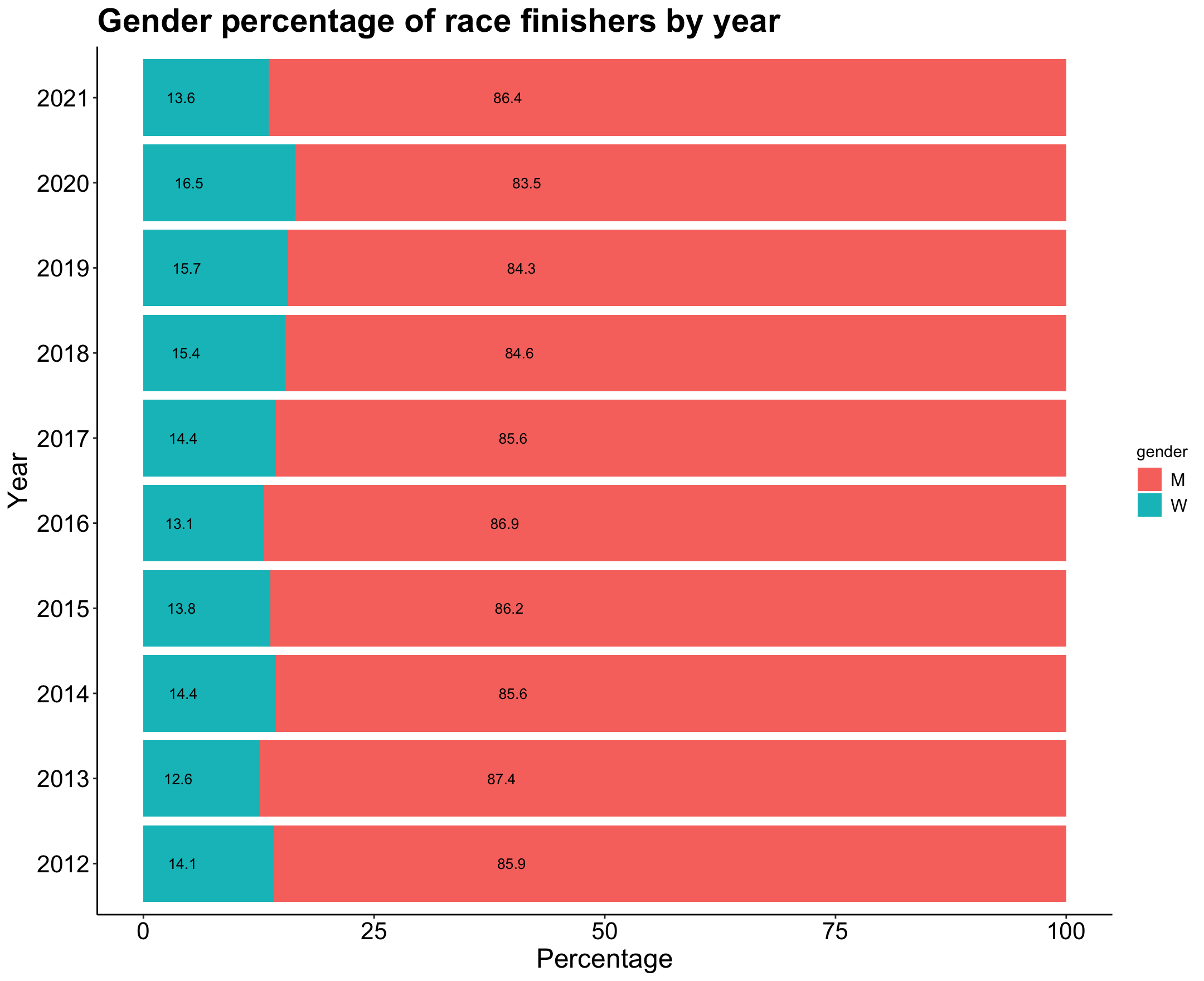
Looks like 2020 was the year with the highest percentage of women finishers.
Modeling the Data
Now that I’ve explored the data a good amount, I’m the most curious about digging deeper into how well certain factors (age, gender, course length, elevation gain) predict speed. Since speed is one dependent variable and the various factors are independent variables, a regression analysis seems like the best option here. I’m going to train both a linear regression model and a random forest regression model to see which one fits the data better. All of this is done with the help of the amazing tidymodels package!
First, I created my modeling dataset that only contains the variables I want included in my model. Next I split the data by gender into a training and a testing set. There is a large class imbalance within the gender variable, so I was sure to specify the proportion to split on so that one data set (training or testing) didn’t end up with a larger proportion of men or women.
joined_mod <- joined %>%
  select(mph, AgeAtRace, gender, distance_mi, elevation_gain)

set.seed(123)
race_split <- joined_mod %>%
  initial_split(prop = 0.8,
                strata = gender)

race_train <- training(race_split)
race_test <- testing(race_split)
After that, I specified my models, both linear and random forest.
#linear regression model specification
lm_mod <- linear_reg() %>%
  set_engine("lm")

#random forest model specification
rf_mod <- rand_forest() %>%
  set_mode("regression") %>%
  set_engine("randomForest")
Then I’m going to fit a basic linear regression model and a random forest regression model to my training data. I’m first doing this without any resampling of my data, which I address a little later on. You’ll notice I log transform the speed(mph) variable in both models as the distribution of the original variable is log normal.
#fitting linear regression and random forest models to data without bootstrapping
fit_lm <- lm_mod %>%
  fit(log(mph) ~ .,
      data = race_train)
fit_lm

fit_rf <- rf_mod %>%
  fit(log(mph) ~ .,
      data = race_train)
fit_rf
Now that the models are fit on my training data, I wanted to evaluate their performance using my testing dataset that I created above.
#evaluating model performance on testing data without bootstraps
results.b <- race_test %>%
  mutate(mph = log(mph)) %>%
  bind_cols(predict(fit_lm, race_test) %>%
              rename(.pred_lm = .pred)) %>%
  bind_cols(predict(fit_rf, race_test) %>%
              rename(.pred_rf = .pred))

metrics(results.b, truth = mph, estimate = .pred_lm)
metrics(results.b, truth = mph, estimate = .pred_rf)
> metrics(results.b, truth = mph, estimate = .pred_lm)
# A tibble: 3 × 3
.metric .estimator .estimate
<chr> <chr> <dbl>
1 rmse standard 0.192
2 rsq standard 0.530
3 mae standard 0.148
> metrics(results.b, truth = mph, estimate = .pred_rf)
# A tibble: 3 × 3
.metric .estimator .estimate
<chr> <chr> <dbl>
1 rmse standard 0.179
2 rsq standard 0.632
3 mae standard 0.138
From the metrics that are printed out, you’ll see that the random forest model has slightly higher performance, particularly in the R-squared value of 0.632. While this is not the most amazing value for our model to predict speed, it is significant and tells us that our data fit the model predictions relatively well.
I was curious how the models would perform on a resampled dataset to better evaluate both models. I used the bootstrap method, which creates a larger simulated dataset by drawing with replacement from my original dataset and then fitting the model on that. The default for this with the bootstraps() function is 25 times, which was fine with me and took a significant amount of time to run on my random forest model!
I first created my new resampled dataset, and then fit my models on that bootstrapped dataset.
#create 25 bootstrap resamples
race_boot <- bootstraps(race_train)

#fitting lm and rf models to data with bootstrap resampling
lm_res <- lm_mod %>%
  fit_resamples(
    log(mph) ~ .,
    resamples = race_boot,
    control = control_resamples(save_pred = TRUE)
  )

#random forest takes super long time to run
rf_res <- rf_mod %>%
  fit_resamples(
    log(mph) ~ .,
    resamples = race_boot,
    control = control_resamples(save_pred = TRUE)
  )

glimpse(lm_res)

#evaluating performance with metrics
collect_metrics(lm_res)
collect_metrics(rf_res)
> collect_metrics(lm_res)
# A tibble: 2 × 6
.metric .estimator mean n std_err .config
<chr> <chr> <dbl> <int> <dbl> <chr>
1 rmse standard 0.192 25 0.000175 Preprocessor1_Model1
2 rsq standard 0.544 25 0.000633 Preprocessor1_Model1
> collect_metrics(rf_res)
# A tibble: 2 × 6
.metric .estimator mean n std_err .config
<chr> <chr> <dbl> <int> <dbl> <chr>
1 rmse standard 0.180 25 0.000246 Preprocessor1_Model1
2 rsq standard 0.641 25 0.000696 Preprocessor1_Model1
I then collected the metrics created in new both resampled datasets to see how either one performed on the data. It looks like the random forest is again the better predictor, this time with a slightly higher R-squared value (than the linear regression) of 0.641. This means that approximately 64% of the variance within the speed variable is explained by the predictor variables in the random forest model I specified.
Then I plotted the results to visualize each model. The blue line shows the model prediction compared to the ideal grey dotted line. While it’s a little hard to tell in the plot, the random forest model provides slightly better predictions than the linear model. This may because more of the points are clumped in a tighter area in the middle, which likely increases the R-squared. There is a larger spread and variance within the linear model.
#evaluating fit for both models with bootstraps
results2 <-  bind_rows(lm_res %>%
                        collect_predictions() %>%
                        mutate(model = "Linear model"),
                      rf_res %>%
                        collect_predictions() %>%
                        mutate(model = "Random forest"))

#plot the above results
p8 <- results2 %>%
  ggplot(aes(`log(mph)`, .pred)) +
  geom_abline(lty = 2, color = "gray50") +
  geom_point(aes(color = id), size = 1.5, alpha = 0.3, show.legend = FALSE) +
  geom_smooth(method = "lm") +
  facet_wrap(~ model) +
  labs(title = "Comparison of bootstrapped models",
       x = "Actual values",
       y = "Predicted values") +
  theme_classic() +
  my.theme
p8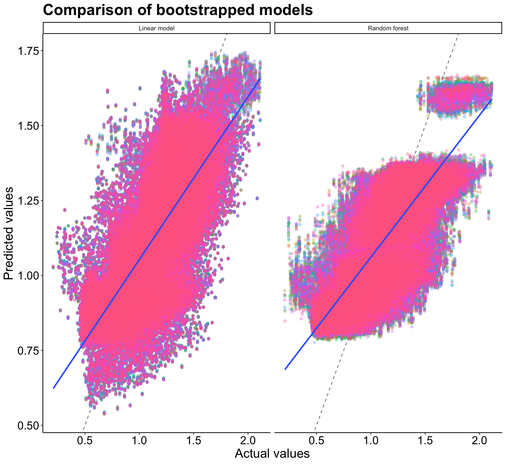
Takeaways
All in all, the predictor variables I thought would have the most influence on speed (age, gender, course length, elevation gain) explained about 64% ( within the random forest model) of the variance within the speed variable. This means that those variables do a pretty good job of predicting speed during an ultramarathon, but there are likely other factors that also contribute. These could be things like starting elevation, wind on race day, how somebody slept, what they ate, etc. And of course, speed isn’t everything in these long races! These are tests of mental and physical endurance and oftentimes, speed is the last thing on most runner’s minds.
Thanks for joining me into this exploration - next time you see somebody running, just think of all the factors that must be contributing to how fast they’re going (good and bad)!
Full code for this project available on my Github.